
Today we can use a variety fonts but there was a time when we didn't have web-fonts and only a few variations. Most usable were — Georgia, Arial and Times New Roman. But if you wanted to do something unusual and use your own fonts — that's what I would call pain in the ass. The `@font-face` rule was announced only with the CSS3 fonts module.
The first formats for embedded fonts were Embedded OpenType file (*.EOT) and Portable Font Resource (*.PFR). But let's talk about the three most used methods. And it could seem like these methods came from 1998 but no, I found articles about these methods from 2008 and even later years.

On the web fonts was almost always paired — one font for headers, one for body text. For headers, designers often used some distinctive fonts and to make that possible developers used images. A designer saved a picture of the header text and passed it to a developer. Just pure images of the text — it was the easiest way to implement a custom font. Sometimes when the client wanted to change a header text by themself developers used images of cut out alphabet and replaced header text with images — word by word.

A combination of JavaScript and Flash was used to replace parts of the text on a page with a Flash movie that represented the text. Here are the links:

There were two main libraries: Cufon and Typeface.js.
Here is a comparison of these two libraries:
 |
We will make your website the old-fashioned way! |
|---|---|
|
Back then before the `block` layout, the only way to make a layout was a table layout. It was everywhere. Using a table is a horrible idea for any layout, well, excluding of course table itself. And it is funnier that we beat this limitation more than 10 years ago but look at your mailbox — we are still using this outdated approach. Just look at the image below, I call it the "HTML Nightmare". 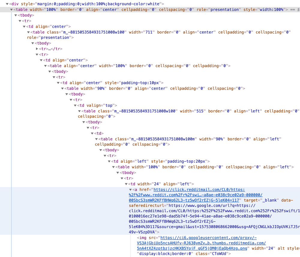
|
Around the beginning of 2007, a phenomenon called Web 2.0 began to emerge. Web 2.0 was a modern approach to the old web. New technologies, social media growth and new websites where the content was created by users and not by admins — all of these factors, created Web 2.0.
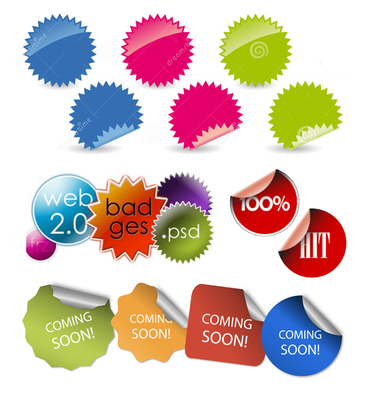
We specific styles for buttons, mostly gradients, big border-radius, and glares. Designers loved to use PNG stickers on Web 2.0 when they wanted to tell users about sales, offers or just show how awesome their website is. And another Web 2.0 feature is tag clouds — a tiny block with commonly used tags - the more popular the tag, the larger it is.

It’s now abandoned, but a lot of websites were built on FLASH technology.
Basic HTML technologies didn’t provide enough tools for designers to express their ideas and FLASH which was used commonly to create an animations so interactive presentations stepped into the Web.
For designers who wanted to do web development — FLASH websites were the breath of fresh air. Everything you could imagine was possible — from complex interactive animations to 3D.
The main source of inspiration was thefwa.com and it was an honor to add an FWA label to a website.
Sounds good, right? But what happened with FLASH then? Well, briefly it wasn’t secure, it was heavy to load, the 'Apple effect' and HTML5.
Unfortunately I can’t provide any links for you, because you can’t open them, FLASH technology is deadly dead right now.
It’s hard to imagine right now but FLASH was a big part of the internet not so long ago — websites, games, banners and I think that more than 50% of all designer's portfolios were built on FLASH.

The “Home” icon was born in the late '90s but the “HomePage” button was there from the beginning. During the years this button went through different phases but it's not disappeared, it's just hidden. One pattern — the obligatory “HomePage” link in the menu was transformed — now this “HomePage” link is placed in a company logotype, and every website or almost every website uses this pattern.

Another thing that we don’t see now is — site map page. Like a “HomePage” button it was one of the obligatory things to have on a website. Basically a sitemap is a page that shows all pages on your website as a structured list.

Before the comments sections, the guest book was a page on a website where people wrote their comments. And it doesn't matter if you had a personal webpage or you were a big company - it was a communication hub. Guest books were made in many different technologies, even on Flash.
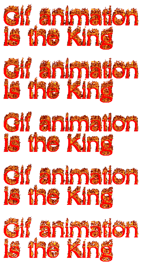


Before ThreeJS, GASPJS, SVG, CSS animations the only way how you could express yourself in the old internet was with a GIF animation. The fanciest were spinning logos.






































More cool images you can grab here on gifcities.org
 2016
2016 2014
2014 2012
2012 2010
2010 2008
2008 2007
2007 2005
2005 2002
2002 1996
1996